
In the coming week, when we come to pick you up, we are going to look a little different.
Since day one, our main focus has been on consistently improving your commute experience. While that continues to be our first priority, we are now refining our visual identity—one that reflects the brand we’ve evolved into.
We’re excited to share our new look which represents what an elevated commute experience should look like.
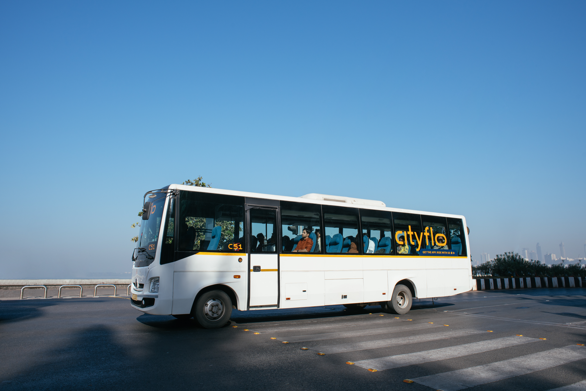
This new, simple, clutter free identity reflects the comfort and ease of the Cityflo experience. The O in the logo is our unique identifier—a window. It represents the window of time you get to yourself in a Cityflo every day. It’s a world that’s all yours, between home and work, where you transition between your personal and professional lives.
In fast-paced cities time is a currency we’re always running short on. Despite meticulous planning, we often compromise on quality time for ourselves and our families. While we’re cautious of how we use the free time we do get, we spend a significant amount of it on everyday travel. That’s why, at Cityflo, we’re committed to bringing you a commute experience where you get this time back with every ride—your personal space and two hours of uninterrupted time to yourself, everyday in a city that's always in motion.
But why the rebrand?
The last 8 years have been a journey of discovery, where we took the time to better understand what our customers need, what cities need and what our brand stood for. Our service has gone through major improvements in the last couple of years in an effort to provide the most stress-free way to travel to office every day; we’ve upgraded our fleet, brought stops closer to your homes, added new product features and set new benchmarks for customer experience.
However, our visual identity didn’t quite encompass this service upgrade and how we as people evolved over time. While our characteristic yellow and bold logo has gotten us to where we are today, in an industry where the perception of buses is biased, it is important that we use good design to set the tone for what a great bus experience can look like.
Meet the new
Having overcome a pandemic, multiple zoom calls, and countless brainstorming sessions - we’re proud to present Cityflo in its new avatar.
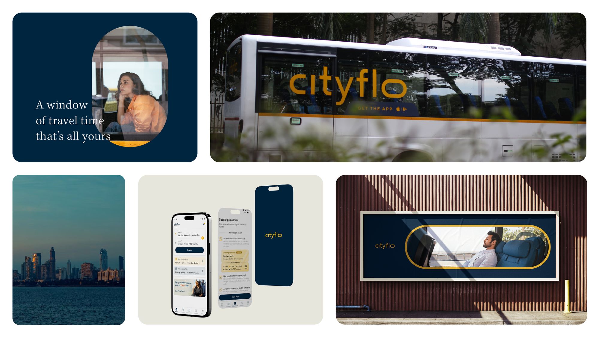
Not to steer away too far from our original identity, the primary colours of our logo are a muted mustard yellow logo, complemented by a deep blue (indicative of our sea of blue seats). We’ve added a host of secondary colours that aim to make the brand more vibrant.
In the next few weeks you will see:
- A thinner, modern and monochromatic logo in mustard across all our channels, especially our bus and app
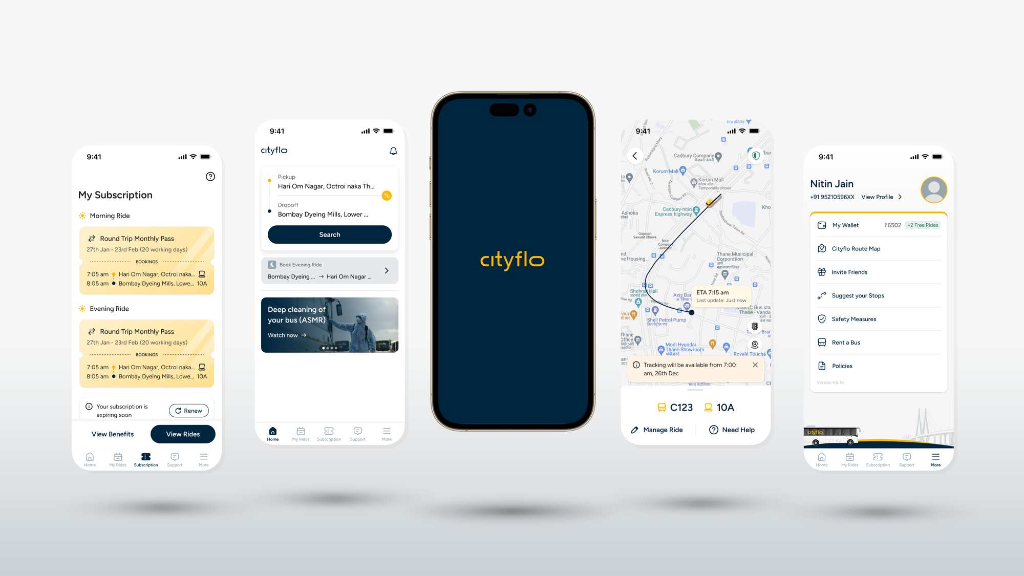
- A cleaner, more intuitive app interface for all your ride bookings
- Use of Cityflo’s O element in our buses, advertising, website and app
- An extensive colour palette that uses the spectrum of colours that represent the colours of dawn to dusk
Click here to download or update your app for the full Cityflo experience.
With our new brand identity, our hope is that we’re able to instantly show the city what a good commute experience can look like - that we’re able to capture the essence of how you feel when you’re on board with us. We hope you’re as excited as us to enjoy the best seat in the city.